
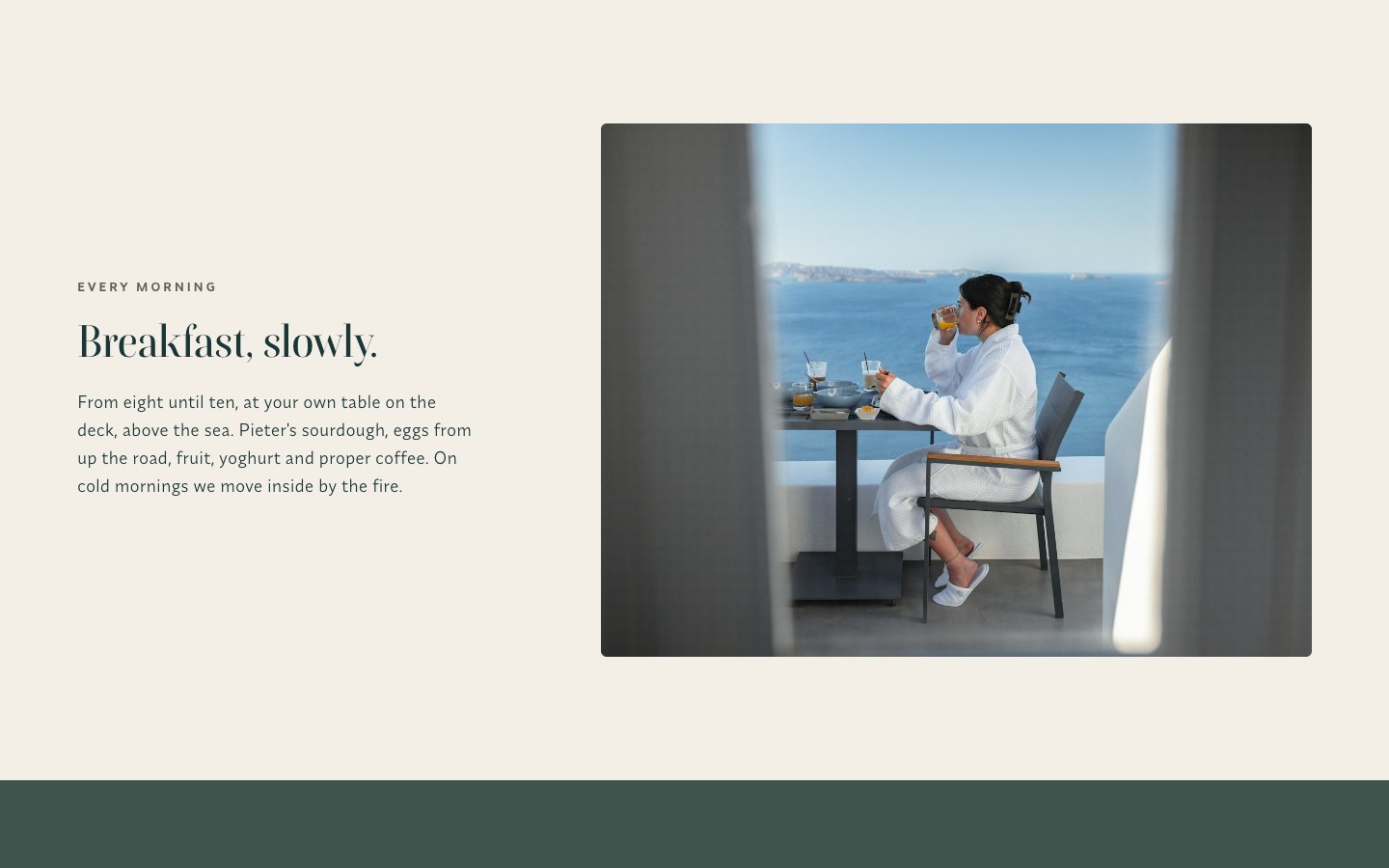
01 / The brief
A guesthouse that feels like the house.
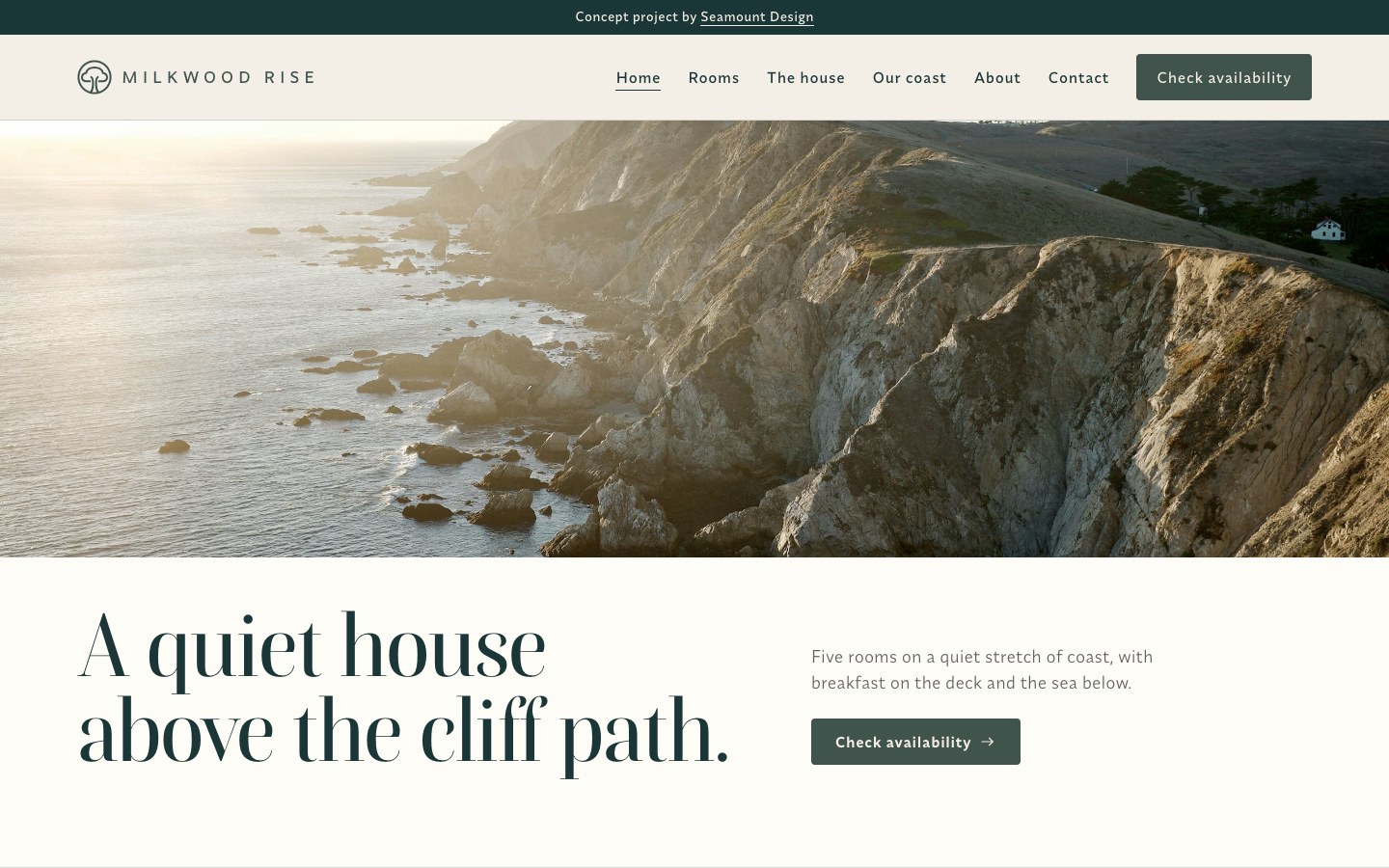
The owners live in the house, bake the bread and know every path on the coast. Their old site looked like every other guesthouse in town and sent people to booking platforms. They wanted a site that feels like the house: calm, personal and clear about rates, so guests book direct.
02 / Rooms
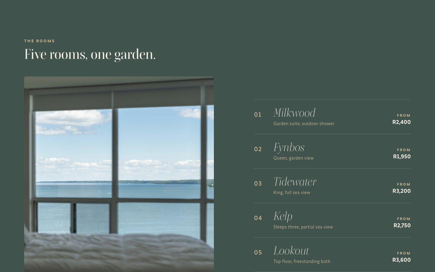
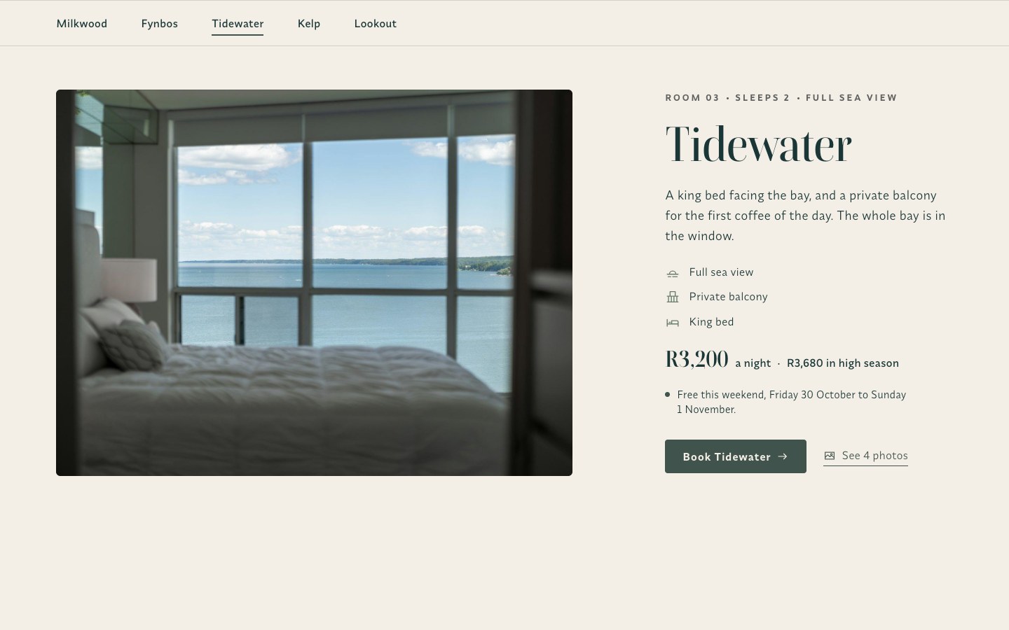
Rooms you can compare at a glance.
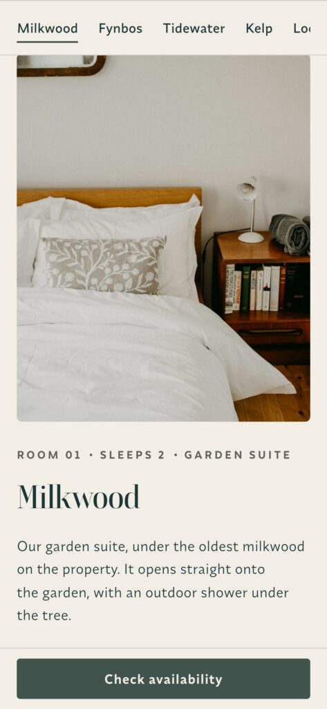
Each room gets a full spread: one photo, three facts, the rate and the high season rate, and whether it's free this weekend. A bar under the header follows you down the page, and every room opens a small photo gallery.
03 / Booking
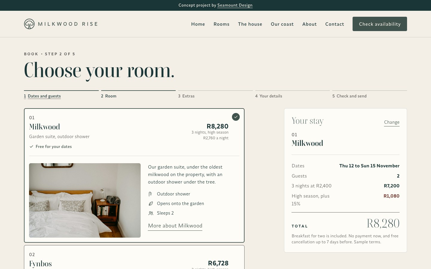
A booking flow that works.
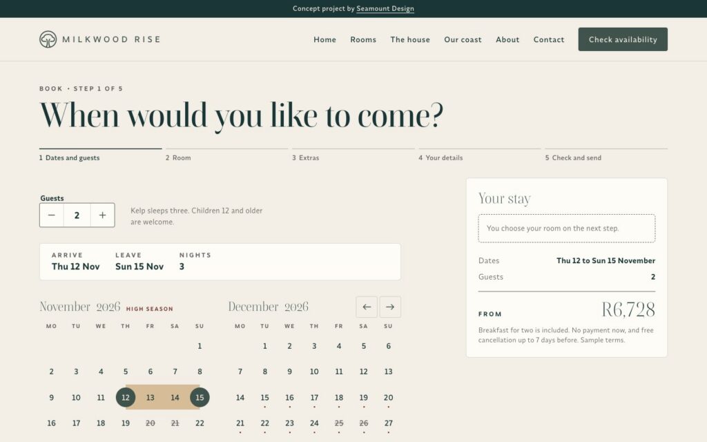
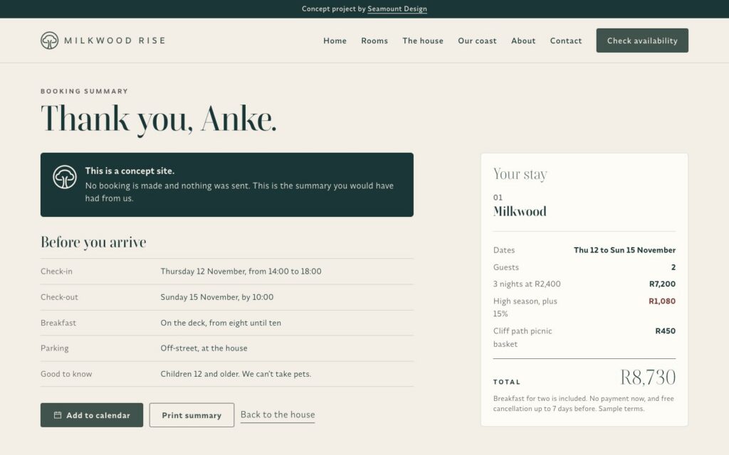
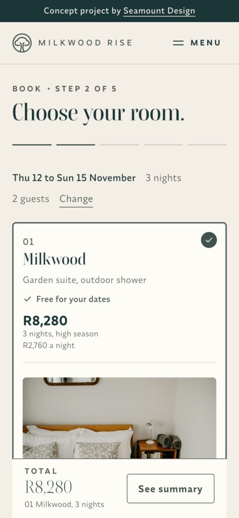
Five steps: dates and guests, room, extras, details, then check and send. The calendar shows high season and fully booked nights. Weekend stays under two nights get one-tap fixes. Rooms that are booked say when they're free again, and three guests see the one room that fits. The price is worked out night by night and shown at every step. On the concept nothing is sent. A live version would connect to a channel manager.
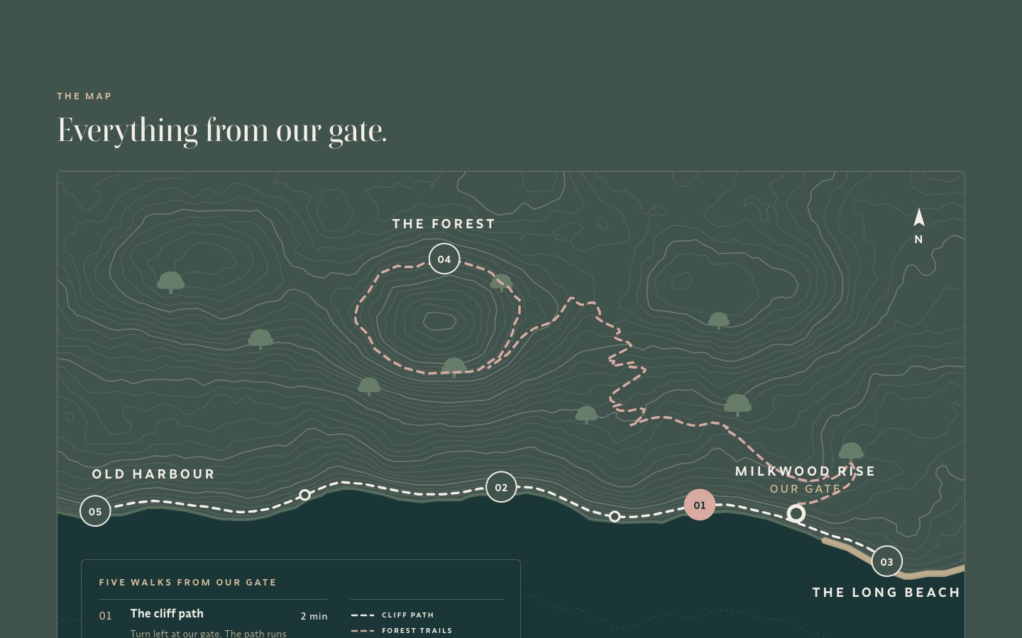
04 / Map
Our own map of the coast.
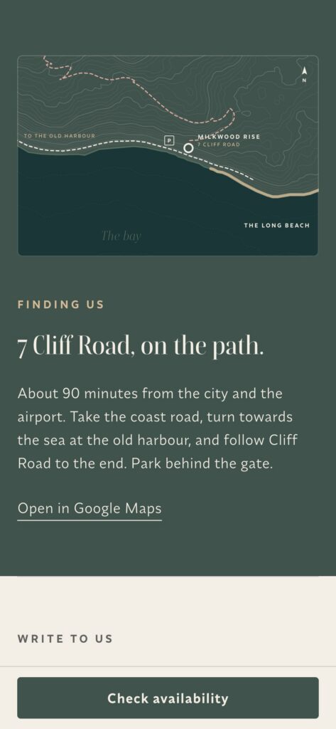
Guests get a map of five walks from the gate. We drew it from a single height field, so the contour lines never cross, and each path follows the land the way a real one would. Choose a walk in the key and the map shows it.
05 / Phone first
Built from the phone up.
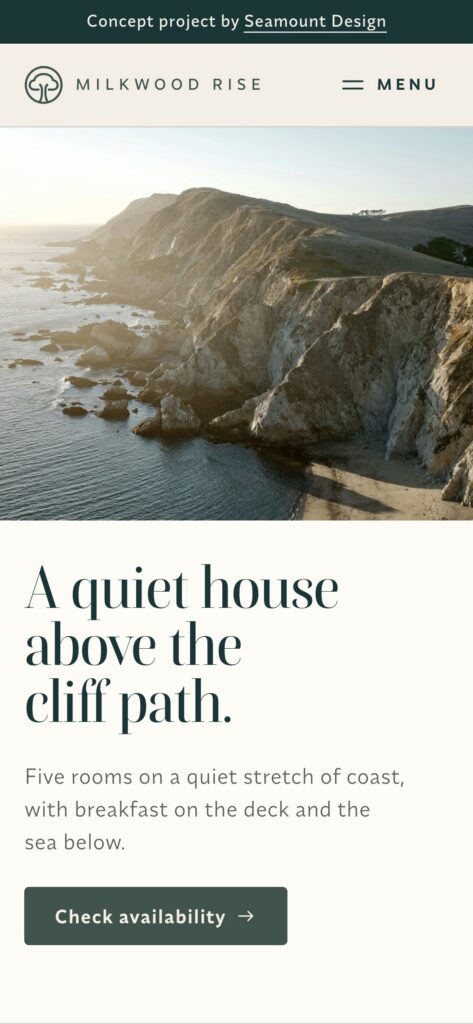
Every page was built from the phone up and checked at four widths. On a phone, the booking total stays in a bar at the bottom. Forms say exactly what to fix, colours pass WCAG 2.2 AA, and the motion is a quiet rise into view that switches off for anyone who prefers less movement.
More from the booking flow